Anthony Burrill is one of the most distinctive voices in contemporary graphic design, known for his thought-provoking posters, printed traditionally in letterpress. He has never worked for another design firm, and his first studio was at home — at his kitchen table.
Upon graduating in 1991, he has worked independently in loose collaboration with friends, designers, artists and a number of institutions such as the Design Museum. Some of his most famous work is self-published making graphic design, a standalone discipline in itself.
Povinnosť energetickej certifikácie sa vzťahuje na novú a na významne obnovovanú budovu v prípade kolaudačného konania po 1. januári 2008, ako aj na budovu predávanú a prenajímanú po 1. januári 2008.
Hlavným cieľom smernice teda aj zákona o energetickej hospodárnosti je:
- zlepšiť energetickú hospodárnosť budov zmenou tepelnej ochrany, vykurovania, vetrania a chladenia vo vzťahu k vonkajším klimatickým a miestnym podmienkam, prípravy teplej vody a osvetlenia,
- zabezpečiť požadované podmienky týkajúce sa vnútorného prostredia budov
- zefektívniť výstavbu a prevádzku budov.
Energetická certifikácia je teda povinná pri predaji a prenájme všetkých typov stavieb a vzťahuje sa na:
- rodinné domy
- bytové domy
- administratívne budovy
- budovy škôl a školských zariadení
- budovy nemocníc
- budovy hotelov a reštaurácií
- športové haly a iné budovy na šport
- budovy na veľkoobchodné a maloobchodné služby
- ostatné nevýrobné budovy spotrebúvajúce energiu
nevzťahuje sa na
historické budovy, kostoly, dočasné stavby, priemyselné stavby, bytové budovy s dobou užívania menej ako 4 mesiace v roku, samostatne stojace budovy s úžitkovou plochou menšou ako 50 m2
Energetický certifikát
Energetický certifikát je dokladom, ktorý je potrebné predložiť ako prílohu (originál) ku kúpno-predajnej zmluve (resp. jeho overenú kópiu pri prenájme) rovnako, ako v prípade výstavby novej budovy alebo vykonania významnej obnovy je dokladom ku kolaudácii.
Objednanie energetického certifikátu budovy je povinnosťou vlastníka budovy.
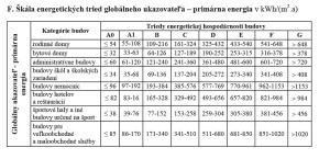
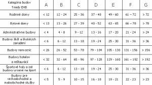
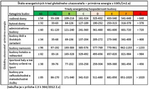
Hodnotené budovy sa zaraďujú do nasledovných energetických tried A až G:
What is „User Experience Design“ exactly? Should you not start it unless you are fully dedicated, or should you embrace it in the process as soon as possible? Are all designers also user experience designers, or is it a separate expertise?
The debate is as old as the discipline itself, and while picking up a bucket of popcorn, sitting back and watching the drama is sometimes fun, let’s try to figure out which user experience techniques are useful for startups, in-house teams, big corporations and anyone who wants to improve their website, product or service.
Everyone loves a good, clean and simple icon set. Today, we’re honored to present to you a set of 60 vector round icons which was cleverly designed by the creative trio at Roundicons and released exclusively for Smashing Magazine and its readers. Crafted with great attention to detail, this icon set is extremely easy to use and will most probably be the next ultimate resource for any one of your design projects.
This freebie contains 60 icons that can be used for free without any restrictions and serve various design purposes. You can use the icons in your commercial as well as your personal works. Feel free to modify the size, color or shape of the icons. No attribution is required. However, reselling of bundles or individual pictograms is not allowed.
Along with the redesign of the glyphs, I also redesigned the space around the glyphs. Typography is designing the form as much as designing the counter form. Spacing and kerning was a problematic issue in the older Exo, but now it looks beautiful (however, don’t buy it from me, test it for yourself).
This new design is very versatile and I hope to see it used in very different contexts, as the first version has been used. Exo 2.0 has a very contemporary look, so if you want your design to look fresh and stand out, I encourage you to use it.
Even though this font was primarily designed with screens in mind, I also thought about print, so don’t be admired if you see subtle ink traps and find some ligatures for you to have some fun.


